Visualizing usability data with a heat map in R
November 5, 2015
Usability testing is a great way to identify potential problems with an interface. Quantifying the results can help illustrate what's not working and to what extent. One common usability metric is the number of users who successfully (or unsuccessfully) complete a task.
For example, let's say we've redesigned our app's navigation scheme. We want to know whether or not users can successfully navigate the redesign. We can break down the interface elements into features or tasks to test, e.g. swipe left / right to view previous / next pages, find settings by opening the navigation drawer, and so on. To keep our example generic, let's say we have 5 tasks... cleverly named Task A, B, C, D, and E. We run a small usability test with 8 people. We record the data in a spreadsheet (or CSV file) and use 1s and 0s to denote whether a user successfully or unsuccessfully completes a given task. Each row represents a user.
The recorded data looks like this:
Task A,Task B, Task C, Task D, Task E
0,0,1,1,0
0,1,1,1,0
1,1,1,1,1
0,0,1,1,0
1,1,1,1,0
0,1,0,1,0
0,0,1,1,0
0,0,0,0,0
When analyzing and reporting the results, a table similar to this one is often used:
Task A,Task B,Task C,Task D,Task E
2,4,6,7,1
This is a great start. But, visualizing the information can provide clearer insights. A heat map is a great way to enhance the table by adding color to the table of values:
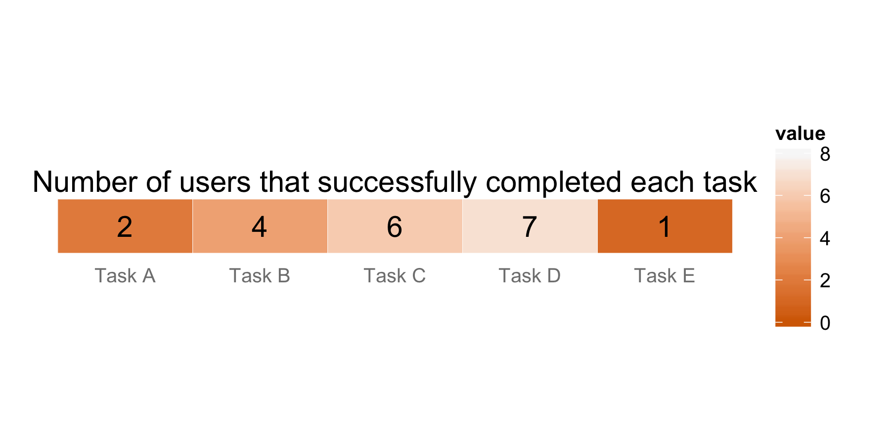
The color scale used in this example goes from dark orange to light gray. If none of the users successfully complete a task, the color is dark orange; if all of the users successfully complete a task, the color is light gray. By color coding the data in this manner, we can immediately see potential problems... the darker the orange, the more we ought to pay attention to it. So, Tasks A and E are on our radar.
Picking a color scheme
Why did I choose dark orange to light gray? There are many color schemes to choose from, but these are my reasons:
- On the low end of the scale, I used dark orange because to me, it represents caution... let's pause and take a look at the data. Red typically signifies "danger" or "stop" and can alarm the team into thinking something is seriously wrong and someone is at fault. When this happens, people tend to get into defensive positions. So, I deliberately did not want to use red.
- So, why not green for the other extreme? Green typically means "okay", right? Rainbow color maps are very popular, but it's difficult to compare relative values. I know what varying shades of orange mean... the lighter the better. If colors start mixing, it takes more mental effort to parse what it indicates. See this post that talks about color maps in detail. Plus, it's not user-friendly for those who are red-green color blind.
- But, light gray? My intent with using light gray is to mimic white. However, white can blend into the background of presentation tools like PowerPoint. In large heat maps with many white cells, they can look like holes in the plot. Light gray stands out just enough where the plot looks whole. It also doesn't have a big impact on the color mixing.
There are other valid color schemes to choose. It also depends on the type of data you want to represent. In this case, this particular scheme has worked for me when I want to show teams potential problems in the interface. It gets the discussion started on where to focus the next design iteration.
Creating the heat map, step-by-step
Preparing the data
Since this is a visualization I commonly use, I thought I'd share how to create it using R and ggplot2, a popular graphics library.
The first thing we need to do is load the libraries we need: ggplot2 and reshape. reshape is used to transform data. If you haven't installed these packages before, you can do so by typing install.packages('package name').
library(ggplot2)
library(reshape)
Next, set the working directory where you have the data saved and read it in. Let's also store basic stats, such as the number of users and the number of tasks:
# Change this to point to your directory
setwd('~/Desktop/uxr-heatmap')

# Read in data
data.df <- read.csv('data.csv')
num.users <- dim(data.df)[1]
num.tasks <- dim(data.df)[2]
Here comes the data preparation part. We want the total number of successes for each task in a data frame and in a format that ggplot2 can use. The following code accomplishes this:
# When R imports the data, spaces in the header row are replaced with "."... let's revert that
task.names <- gsub(".", " ", names(data.df), fixed=TRUE)

# Create a data frame with the total number of successes for each task
total <- data.frame(
  task=task.names,
  value=colSums(data.df)
)

# Reshape the data... ggplot2 uses long format, which has a column for variable types and a column for those variables' values
total.m <- melt(total)
The resulting data looks like this:
> total.m
    task variable value
1 Task A    value     2
2 Task B    value     4
3 Task C    value     6
4 Task D    value     7
5 Task E    value     1
Plotting the results
ggplot2 is a great graphics tool, but it can be a bit overwhelming to use when first starting out. Here's the code to plot the heat map broken down into several steps.
#### Steps to create heat map ####

# 1. Create heat map
dark.orange <- '#d66a00'
light.gray <- '#f8f8f8'
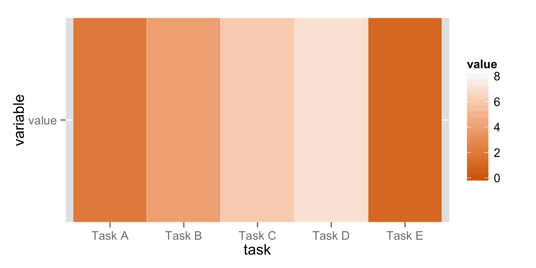
p <- ggplot(total.m, aes(x=task, y=variable, label=value)) +
  geom_tile(aes(fill=value), colour='white') +
  scale_fill_gradient(low=dark.orange, high=light.gray, limits=c(0, num.users))

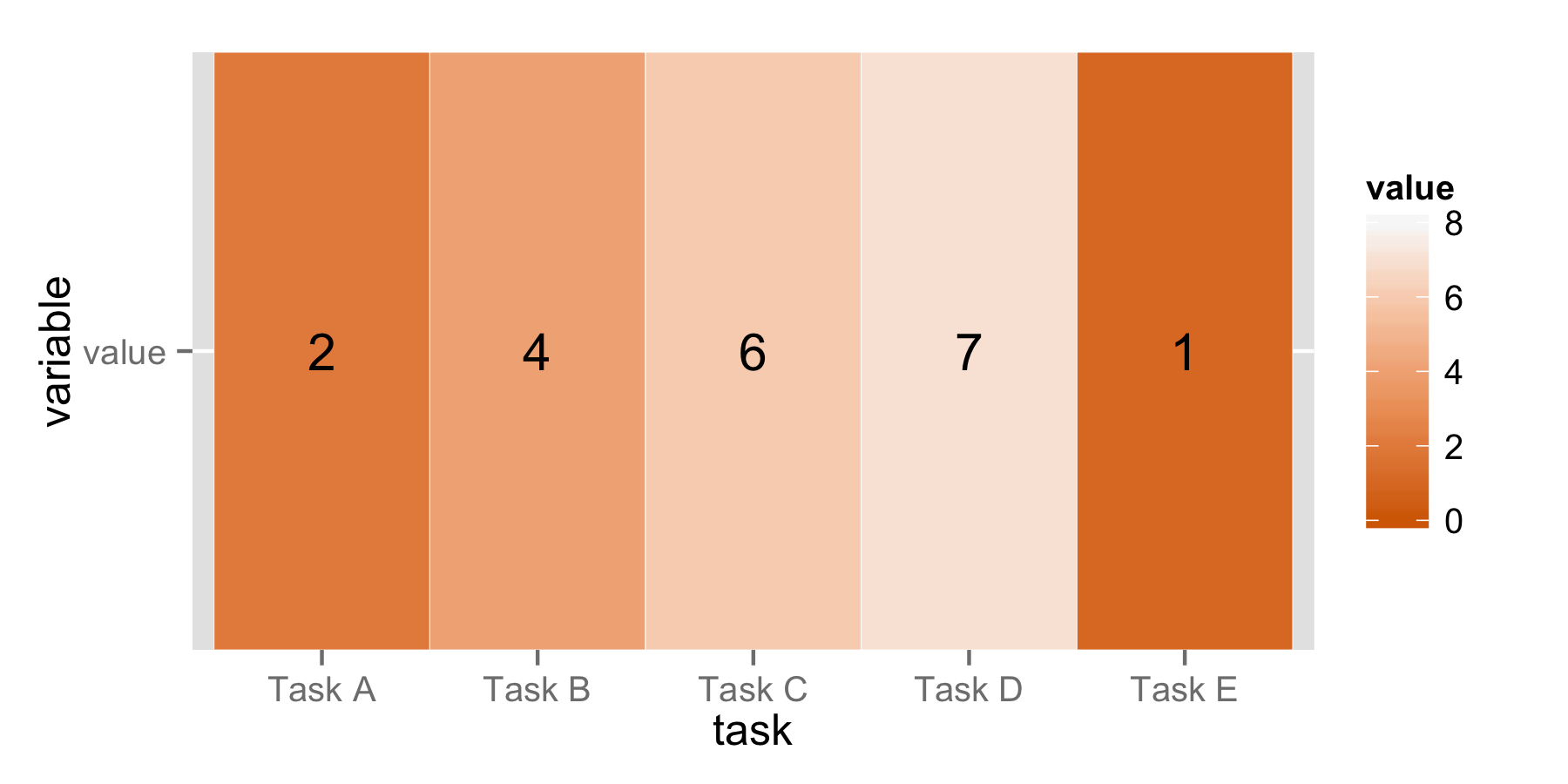
# 2. Add text
p <- p + geom_text()

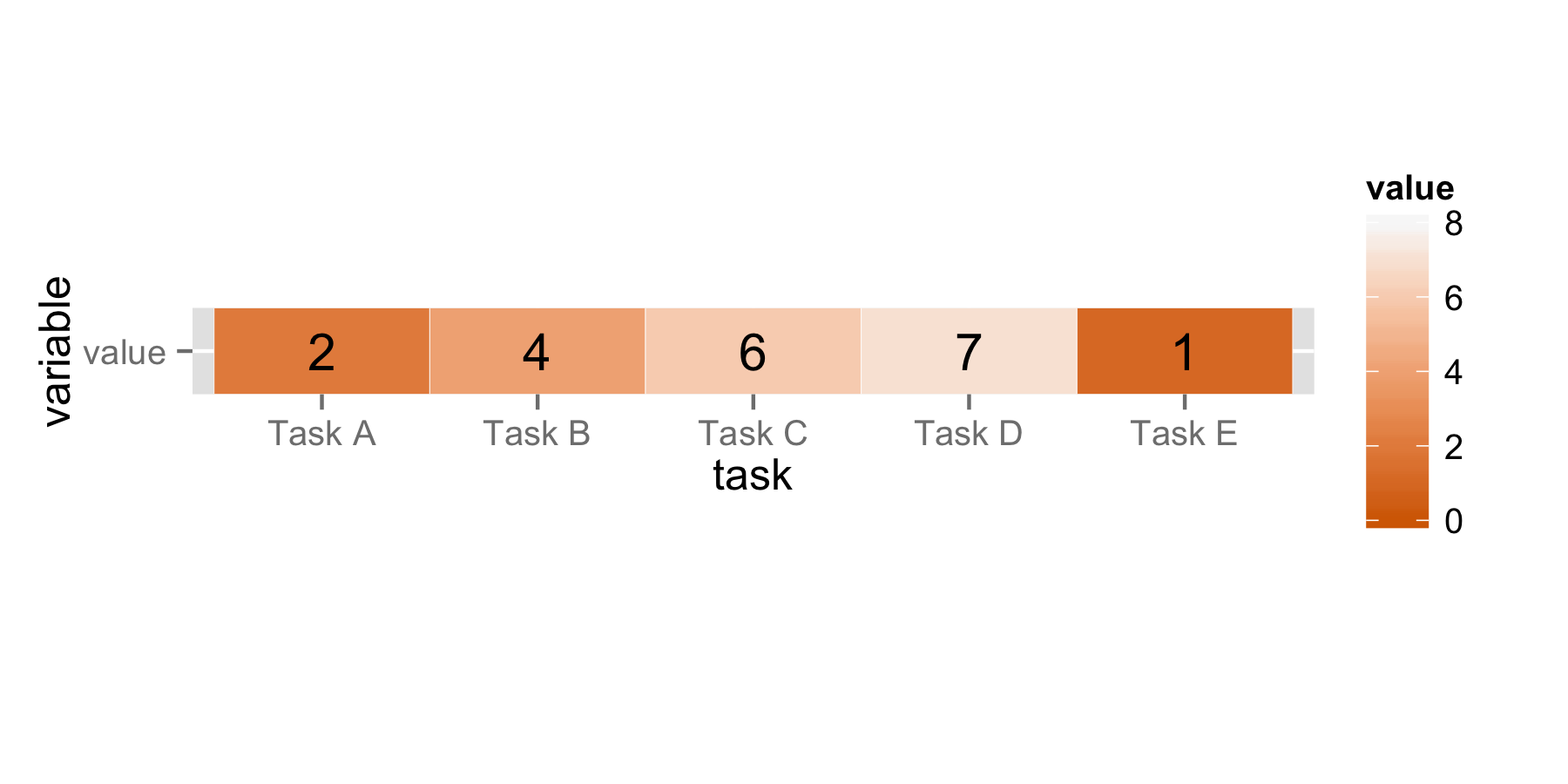
# 3. Re-size the plot
p <- p + coord_fixed(ratio=2/num.tasks)

# 4. Give finishing touches
p <- p + labs(title='Number of users that successfully completed each task') +
  theme(
    panel.background=element_blank(),
    axis.title.x=element_blank(),
    axis.title.y=element_blank(),
    axis.ticks.x=element_blank(),
    axis.ticks.y=element_blank(),
    axis.text.y=element_blank()
  )

# 5. Save the plot
ggsave(filename='heatmap.png', width=6, height=3)
The following pictures show what's happening at each step.
Create heat map:
Add text:
Re-size the plot:
Give finishing touches:

There's our final plot. We can then save it!
Final thoughts
The next time you conduct a usability test, consider using a heat map to visualize table summaries of your data. Choose color scales that are meaningful to you, then plot away!